
I’ve had the same logo for a couple of months already and, while I don’t think it’s bad, I figured it could have more personality. It was a bit too rigid. This is the replacement I came up with:
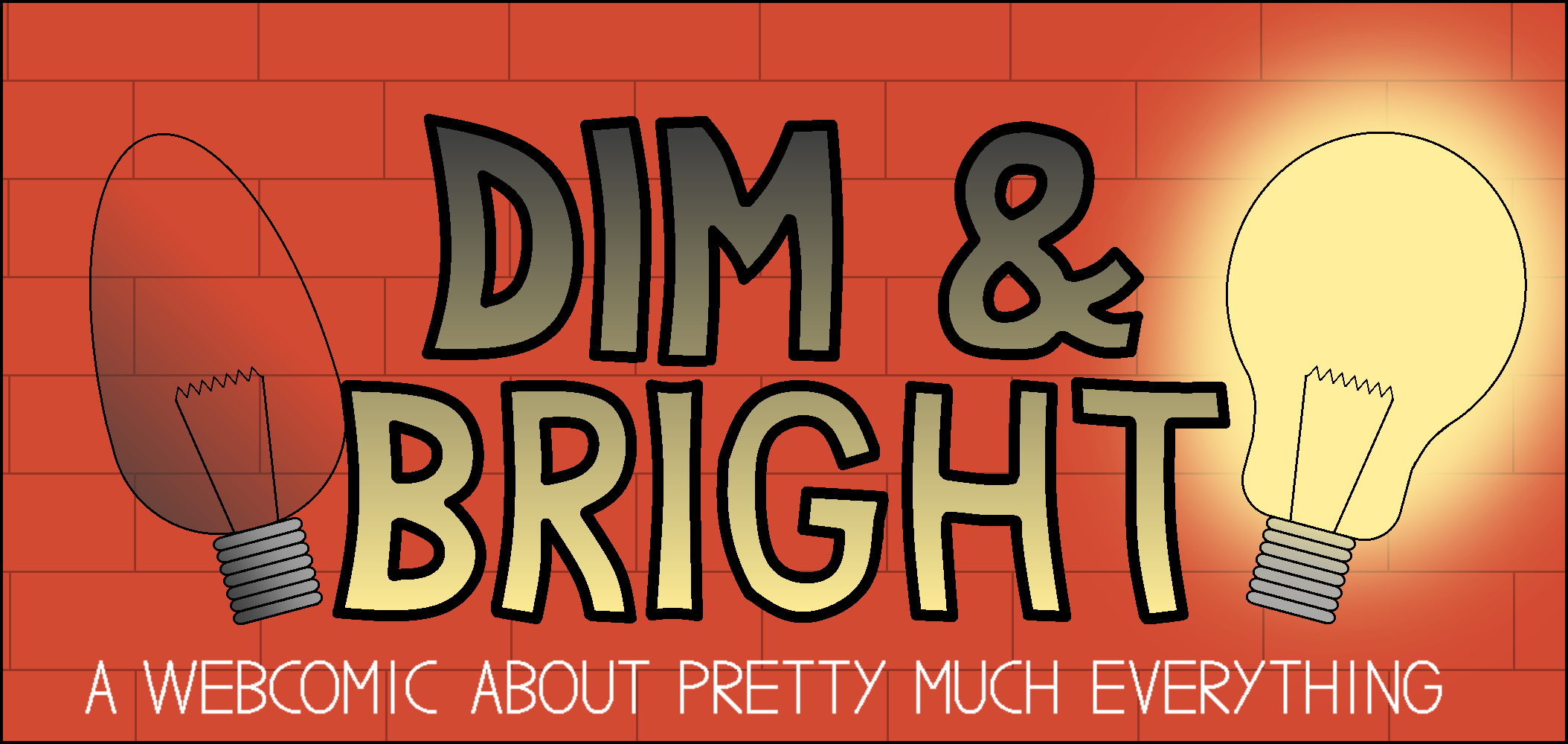
I decided to go for the graffiti style; it reflects the chaotic feeling of my comics. I also replaced my self-insert with light bulbs. My comic may have started as just “relatable humor”, but it branched out as time went on. Ironically enough, Bright Side’s spotlight is not a strong as it used to be.
I’ll change the old logo today. I hope you like the new one.